
ABC Analysis in Power BI: From Theory to a Working DAX Model

The best place to start is with a clear choice: snapshot or dynamic ABC classification, depending on whether you need flexible filtering or a faster report. This article shows how to implement both approaches in Power BI with DAX, which KPIs to show management and which checklist to run through before handing the report over.
In brief:
- Static ABC classification assigns items to a class once and leaves them there until the data is updated manually.
- Dynamic classification calculates each item’s class in real time according to the selected filters, but it demands more computing resources.
- When choosing between them, consider whether users need to see classes change as they filter and how often reviews take place, especially with large data volumes.
- ABC thresholds can be tailored to business needs and changed through parameter tables, which let users adjust them without editing any code.
- The KPIs most often recommended for these reports are item count, share of sales, sales value and quantity sold, which together support effective management of inventory and priority products.
Contents
- Static, snapshot and dynamic ABC: the differences and when to choose which
- How to set ABC thresholds and let users change them
- KPIs and visuals in an ABC report
- The data model and essential DAX steps (Sales → CumulatedPct → ABCClass)
- Practical implementation: a step-by-step example in Power BI
- Pre-handover checklist and the most common mistakes
- The Analitika360 view: when a ready-made solution makes sense
- Analitika360 report packages: where to order and what they include
- Sources
- Frequently asked questions
Static, snapshot and dynamic ABC: the differences and when to choose which
The three approaches to ABC classification differ in when, and how often, each item’s class is calculated. The static approach assigns a class once and does not change it until the data is updated manually. The snapshot approach calculates the classification at refresh time, nightly for example, and stores the result as a table. The dynamic approach calculates the class in real time, depending on the filters selected in the visuals.

According to DAX Patterns, dynamic classification requires an additional class table and is slower and more memory-hungry than the static solution.
When choosing your route, it is worth answering three questions:
- Do users need to see how the class changes when they filter by region or period?
- How many rows does the product fact table contain, and how long does the model take to refresh?
- How often does the business review its ABC thresholds: once a month or every day?
Where data volumes are large and filtering flexibility is not critical, the snapshot approach is a sensible compromise: it gives quick answers in the report and puts less load on the model, although it sacrifices some real-time flexibility.
How to set ABC thresholds and let users change them
The standard thresholds usually give the largest share of sales to class A, a middling share to class B and the remainder to class C, but these values need to be tailored to the specific business’s product portfolio. The ABC Analysis report in Microsoft Business Central lets you change these thresholds when running the report, because the default values are set on a separate setup page.
To build the same flexibility into your own Power BI model:
- Create a separate parameter table, for example “ABC Thresholds”, with columns for the class and the threshold percentage.
- Connect this table to a slicer so that users can choose the threshold directly in the report.
- In the measures that assign the class, use the SELECTEDVALUE function to pick up the slicer value rather than a fixed number.
- Check how the classification changes when the threshold is moved by a few percentage points.
This lets you change the thresholds without editing the model, much as in the Business Central report.
KPIs and visuals in an ABC report
According to the Power BI Inventory KPI documentation, four main indicators are recommended for ABC reports: the number of items in each class, the percentage share of sales, sales value by class and quantity sold by class.
The number of items in class A is usually small, yet this class generates most of the sales. (Microsoft Learn) These products therefore call for priority inventory management and more frequent purchasing reviews.
Interpreting the indicators for business decisions:
- Class A items: high priority for replenishment, more accurate forecasting.
- Class B items: moderate control, periodic review.
- Class C items: minimal attention, possibly larger but less frequent orders.
Visually, a Pareto chart with a cumulative line works best, together with a table showing the cumulative percentage for each item. Management is well served by a summary version with a class overview, while the operations team will find a detailed item list with class and quantity more useful.
The data model and essential DAX steps (Sales → CumulatedPct → ABCClass)
The model needs at least three tables: a date table, a product dimension and a sales fact table, linked by product key and date key. Without a clean star schema, RANKX and ALLSELECTED behave unpredictably.
The core logic of the DAX sequence:
- Sales: a simple measure that sums sales value from the fact table.
- TotalSales:
CALCULATE([Sales], ALLSELECTED('Product')), which returns the total for all selected products, ignoring the row context but keeping outer filters. This principle is described in the ALLSELECTED function documentation. - Rank:
RANKX(ALLSELECTED('Product'), [Sales]), which ranks products by sales value. The RANKX documentation notes that the function has a parameter for handling ties (Skip or Dense), which can change the classification at a threshold. - CumulatedSales: sums sales for all products whose rank is less than or equal to the current product’s rank.
- CumulatedPct:
DIVIDE([CumulatedSales], [TotalSales]), which gives the cumulative percentage used to assign the class. - ABCClass: conditional logic comparing CumulatedPct with the thresholds in the parameter table.
ALLEXCEPT and REMOVEFILTERS are used when you need to keep certain filters (such as the period) but remove others (such as product category) when calculating totals for visuals.
Pro tip: Before writing the full formula, download the DAX Patterns sample files and compare your model’s results against them.
The DAX pseudocode structure looks like this:
ABCClass =
VAR CumPct = [CumulatedPct]
RETURN
    SWITCH(
        TRUE(),
        CumPct <= ThresholdA, "A",
        CumPct <= ThresholdB, "B",
        "C"
    )
Practical implementation: a step-by-step example in Power BI
Implementation starts with the data, not the formulas. Before writing any measures, check that the product key is unique, that zero sales have been removed and that credit notes are not distorting the overall total.
- Create a parameter table with the ABC thresholds and connect it to a slicer in the report.
- Create the basic Sales measure and check it in a table with no additional filters.
- Add TotalSales with ALLSELECTED and compare the result with the unfiltered grand total.
- Add the RANKX measure and check how it responds to sorting the data.
- Create the CumulatedSales and CumulatedPct measures, then check the results with several different slicer selections.
- Add the ABCClass measure and validate a few edge cases around the thresholds.
Pro tip: If the model is large and the dynamic calculation is slow, move the classification into a snapshot table calculated in Power Query or during the ETL process, rather than every time in real time.
Pre-handover checklist and the most common mistakes
Before handing over, it is worth running a short check to make sure the classification is reliable:
- Check the currency, the date format and the effect of returns (credit notes) on sales value.
- Test the classification around the thresholds and settle your RANKX tie-handling policy in advance, as Microsoft Learn recommends.
- Check performance with the full data volume, as ALLSELECTED has limitations in certain DirectQuery scenarios.
- Write brief documentation on how the classification works and when to use a snapshot instead of a dynamic measure.
The most common mistake is forgetting to check that the product key is unique, which skews the RANKX ranking and the entire cumulative percentage.
The Analitika360 view: when a ready-made solution makes sense
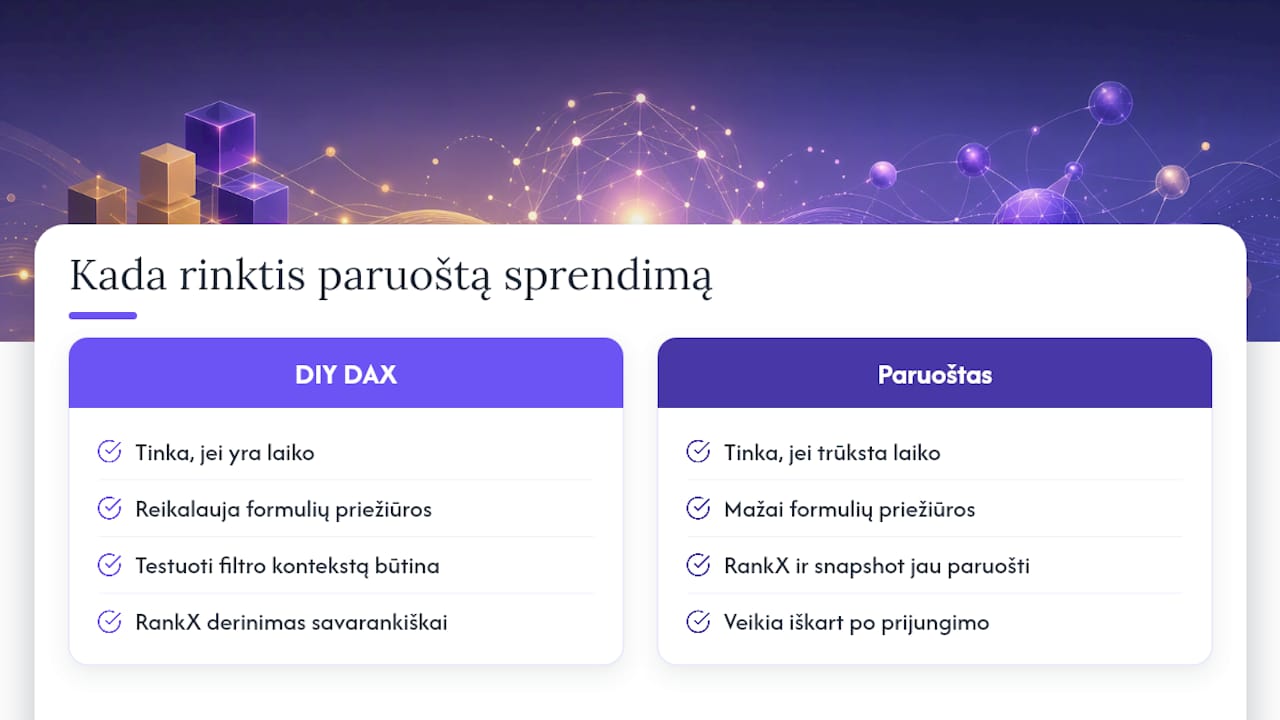
A DIY DAX model works well when you have time to test the filter context and maintain the formulas after every change to the data source. It is a different matter when you need the ABC report to refresh automatically, pulling in data from accounting software without any further fixing of formulas.
A ready-made solution can be an alternative when the analyst has no time to fine-tune the RANKX tie policy or the snapshot refresh schedule themselves, and the business needs a stable solution that works as soon as it is connected.
— Analitika360
Analitika360 report packages: where to order and what they include
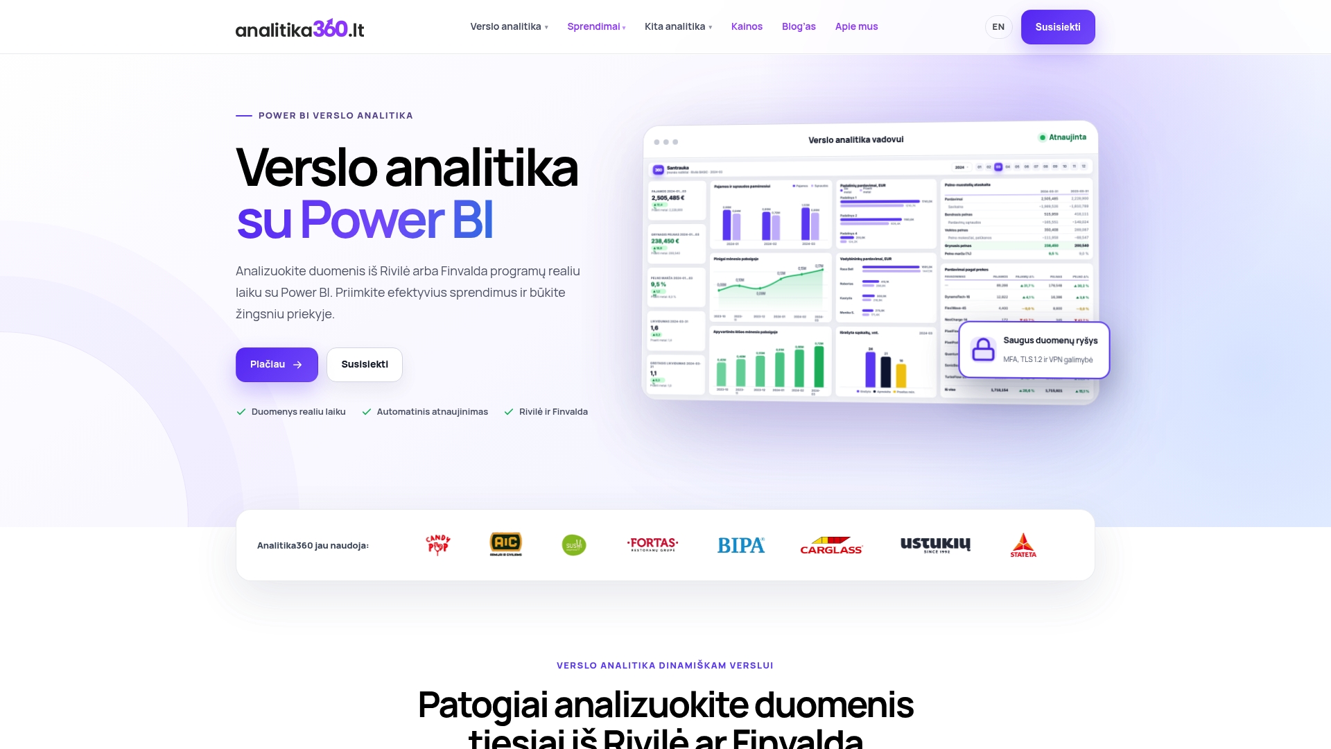
Analitika360’s ready-built Power BI packages for Rivilė and Finvalda users include automatic data refresh and tailoring to your processes. Get in touch to arrange a demo and find out about pricing and PRO options.
Frequently asked questions
What is the difference between static and dynamic ABC classification in Power BI?
Static classification assigns a class once and does not change it until the data is updated manually, whereas dynamic classification calculates the class in real time according to the selected filters. According to DAX Patterns, the dynamic approach needs more computing power and is slower in large models.
How does the RANKX function work in ABC analysis?
RANKX ranks products by sales value and uses that ranking to calculate the cumulative percentage. According to the RANKX documentation, the function has a tie-handling parameter that should be defined in advance so that classification at the threshold is consistent.
Which KPIs are worth showing in an ABC analysis report?
The main indicators are the number of items in each class, the percentage share of sales, sales value by class and quantity sold by class, as set out in the Power BI Inventory KPI documentation. These indicators make it quick to see how many items generate the bulk of sales.
Can users be allowed to change the ABC thresholds in the report themselves?
Yes. This is done with a separate parameter table linked to a slicer, with the measures calculated according to the selected threshold value. The ABC Analysis report in Microsoft Business Central uses a similar principle, allowing thresholds to be changed when the report is run.
When is it worth choosing a ready-made Power BI solution rather than building an ABC model yourself?
A ready-made solution is useful when you need automatic data refresh from your accounting system and have no time to fine-tune DAX formulas yourself. Such packages can be integrated with accounting software without users having to step in to maintain the formulas.