
Solutions

Business analytics for transport and logistics companies

Turnover tells a haulier very little until you can see which route earns and which merely drives. These reports show profitability at the level of the trip, the vehicle, the driver and the customer.

Pricing and plans
Accounting vs analytics
Accounting

In a haulage business the accounts tell you what was earned in total. They do not tell you which trip earned and which merely drove — that needs revenue from invoices, fuel from card statements, driver hours and vehicle depreciation brought together into a single number.

Revenue from invoicesFuel from fuel-card statementsDriver hoursVehicle depreciation = a single number?
Business analytics

That is exactly what an analytics system does: it takes data from Rivilė or Finvalda and from the transport management system, joins it, and recalculates every night. The result is automated reports where trip profitability is visible the same week rather than a quarter later.

Rivilė / FinvaldaTransport management system
Joined up overnight Trip profitability within the same week

The figures worth watching

Profitability by trip and route

Revenue less fuel, driver hours, tolls and depreciation, trip by trip. It usually turns out that a few regular routes are running at break-even.

Fuel cost per kilometre

By tractor unit and by driver. A persistent gap from the average is either a mechanical problem, a driving problem, or something else entirely.

Share of empty running

Kilometres without a load are a straight loss. Broken down by route, this shows where a backhaul is worth chasing.

Tractor and trailer utilisation

How many days a month the equipment actually works. Downtime is expensive even when no report shows it.

Customer profitability

The biggest customer often carries the thinnest margin, because they negotiated the best price. Margin by customer shows it immediately.

Payment terms

Credit terms in transport are long, so the cash cycle is long. Overdue debt by customer is a daily figure, not a quarterly one.
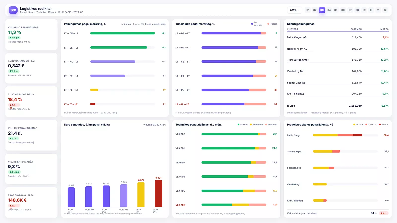
How it looks in the report

Business analytics for transport and logistics companies — Power BI ataskaitos pavyzdys
A sample report using demonstration data.
How to read the report
01

KPI cards

On the left are the figures a manager looks at first: average trip profitability, fuel cost per kilometre, share of empty running, and overdue debt. Each shows the movement since last month, so the direction of travel needs no working out.

02

Route views

On the right are the views that explain why the number is what it is. Profitability by route shows immediately which lanes are running at break-even; empty running by route shows where a backhaul is missing; fuel cost by vehicle shows which units are drifting from the average.

03

Customers and debt

The last block puts customer profitability and overdue debt side by side. It is often the least comfortable view in the report: the biggest customer frequently carries the thinnest margin and the longest payment terms.

Where the data comes from

  • the accounting system (Rivilė, Finvalda or another)
  • the transport management system (trips, loads, mileage)
  • fuel-card statements
  • GPS or telematics data, where it is used
Read access The connection is read-only — the reports read your data, change nothing, and never write back to your systems.

What people usually notice first

  1. 1 The usual finding in the first month is a handful of regular routes that look healthy on turnover and are loss-making on margin. In the combined figures they disappear among the profitable trips.
  2. 2 The second is the gap in fuel consumption between comparable drivers. Once it is there in a table it becomes a conversation rather than a hunch.
Analitika360 client stories

Data that helps you decide

See how companies like yours put Analitika360 reports to work in Power BI.

We took the standard R-Keeper report package and they tailored it to us on top of that. It all just works.
TB
Tomas B.restaurant owner
Twenty ready-made reports — we didn't have to work out what to ask for. Our Finvalda data is finally something you can look at. Recommended.
IM
Ingrida M.accountant
What we liked was that Analitika360 already had a 20-report package for Rivilė users — we didn't have to work out our requirements from scratch. We were up and running quickly, and later they adapted several reports to the specifics of our production. It saved us both time and money.
MK
Marius K.finance director
We are a group of companies running Rivilė, and consolidated reporting was always a headache. Analitika360 started from the standard 20-report package and then fitted it to our group structure — we now see everything in one Power BI model, and it refreshes itself.
GJ
Giedrė Jankauskaitėfinancial accountant
We run six restaurants on R-Keeper and had long been looking for a way to compare results across sites. The standard 20-report package covered most of what we needed, and reports specific to our group were added later.
Andrius Š.director of a restaurant group
We came to them on a recommendation, and the ready-made 20-report standard for Finvalda users was a pleasant surprise straight away. Management now gets a clear financial picture every Monday, and I no longer spend days exporting data into Excel.
RP
Rasa Petrauskienėhead of accounting
We use Rivilė, but we never had time to build reports from scratch. The 20-report package was exactly what we needed — we had it running within a week.
VP
Vaidas P.retail chain manager
We have four cafés on R-Keeper and for a long time we ran them on gut feel. The Analitika360 reports showed us things we had simply never noticed. We now decide on the numbers rather than on guesswork.
LK
Laura Kazlauskienėfinance director of a café group

Where to start

Most people start with a ready-built report set, which connects to your accounting system within a few days, and add the industry-specific reports as a second stage. Describe your situation and we will tell you what would work best in your case.

Report examples