






“
We took the standard R-Keeper report package and they tailored it to us on top of that. It all just works.
A service business sells time, so profitability comes down to how many hours are billed and at what rate. These reports show that by client, by project and by person.
A service business sells time, so profitability comes down to two things: how many hours become an invoice, and at what rate. The two numbers are rarely seen together — the hours live in the time-recording system, the revenue in the accounts.
Joined up, project margin stops being a matter of instinct. The analytics show which projects look good on paper and lose money in hours, and which clients absorb a disproportionate amount of attention.
Contract value against the hours actually spent. Projects that look healthy often turn out to be loss-making once every hour is counted.
How much working time actually becomes an invoice. It is the one figure that explains almost all of a service firm's profitability.
Who is overloaded and who has capacity, week by week rather than by feel. It lets you hire before the crunch rather than after it.
The real one, not the rate card: contract value divided by hours. Discounts and work done for free erode it quietly.
A client who constantly asks for small fixes can cost more than they bring in. Hours by client makes that visible.
How much of the revenue comes from ongoing contracts and how much from one-off work. That ratio decides how predictable the business is.
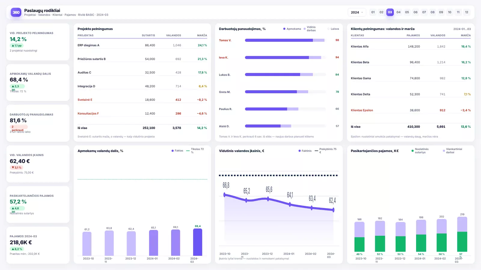
On the left: average project profitability, the billable share of hours, staff utilisation and the average hourly rate. Together they answer whether the firm is running efficiently, before you look at any individual project.
The project table sorts by margin, so loss-making work is visible immediately — alongside the hours that made it so. The utilisation view next to it shows who is overloaded and who has capacity.
The bottom row tracks trends: the billable share of hours, the actual hourly rate against the rate card, and the share of recurring revenue. A rate that is quietly falling almost always means discounts or work done for free.
See how companies like yours put Analitika360 reports to work in Power BI.
Most people start with a ready-built report set, which connects to your accounting system within a few days, and add the industry-specific reports as a second stage. Describe your situation and we will tell you what would work best in your case.