
Cash flow analysis in Power BI: how to roll it out in your finance team

Cash flow analysis in Power BI gives you a real-time view of cash flow with a rolling forecast and a ready-made connection to your Rivilė or Finvalda data. The report shows net cash flow along with operating, investing and financing movements, and the data refreshes automatically, with no manual work in Excel. Below you will find how the set-up is structured, which visualisations are worth using, how to model scenarios and how Analitika360 puts such a solution into practice.
In brief:
- If you want to use Power BI for cash flow analysis, you need to make sure that the data from Rivilė or Finvalda is properly prepared and its structure is clear.
- For effective visualisation, waterfall charts, KPI cards and trend charts work best, as they let you quickly assess the company’s financial position.
- Automatic data refresh from accounting systems reduces the need for manual work and makes the data more reliable.
- The sensible place to start is with data quality and tidying up the chart of accounts, not with rolling out complex forecasting models straight away.
- For short-term cash flow forecasting, a seasonal average and “what if” scenarios with clearly written-down assumptions work best.
Contents
- What a Power BI cash flow report shows: the key metrics
- Data sources and set-up: preparing Rivilė, Finvalda and Excel data
- How to build effective cash flow visualisations in Power BI
- How cash flow forecasting and scenario modelling work in Power BI
- How to ensure automatic data refresh and governance
- Analitika360’s experience integrating Rivilė and Finvalda data
- Why most cash flow projects fail for reasons other than technology
- The Analitika360 solution: from data to decisions in weeks, not months
- Sources
- Frequently asked questions
What a Power BI cash flow report shows: the key metrics
A cash flow report in Power BI answers one question: will the company have enough cash next month, and where will it come from? The Microsoft Learn documentation describes the cash overview content, which combines cash reporting with forecasting features integrated with Dynamics 365 Finance.
A report of this kind usually has several layers:
- Net cash flow, broken down into operating, investing and financing flows.
- Period comparison, setting the month’s result against a rolling 12-month average and a minimum buffer threshold.
- Ageing analysis, showing how many days receivables and payables are overdue.
- Planned versus actual receipts, so that management can see where the forecast departs from reality.
- Segmentation by project, customer or payment type, because one large customer can distort the overall picture.
Together, these layers let you answer not only “how much cash is in the account right now” but also “why has the cash flow taken this shape”. The Dynamics 365 financial insights documentation shows that dashboards of this kind use Power BI for KPI cards and charts, bringing the data together into a single view for decision-making.
Data sources and set-up: preparing Rivilė, Finvalda and Excel data
Before connecting Power BI to an accounting system, you need to put the data itself in order, because a poor structure will show up in the report immediately. Local integration providers note that a daily data refresh directly from the accounting database, for example Rivilė GAMA, cuts the need for manual work to a minimum.
The set-up steps look like this:
- Gather the core tables: bank statements, payment lists, invoice statuses (paid, pending, overdue) and an exchange rate table if you work in more than one currency.
For Finvalda users a separate integration scenario is usually the right fit, because the export structure differs slightly from Rivilė’s, so it is worth checking in advance how automatic reports from Finvalda work in practice.
How to build effective cash flow visualisations in Power BI
A good visualisation does not decorate a report; it shortens the time it takes a manager to make a decision. A waterfall chart shows best how net cash flow changed over a period: from the opening balance, through receipts and payments, to the closing balance.
Other tools that prove their worth in finance dashboards:
- A line trend chart with a rolling total, so that you see the direction of travel, not just a single month’s result.
- Drill-down by period, customer or project, without opening an additional window.
- A heat map or conditional formatting for debt ageing, so that overdue amounts stand out in red straight away.
- KPI cards showing net cash flow, the liquidity ratio and average payment term in a single row at the top.
At DAX level, three measures are most commonly used: a running total from the start of the period, a 30-day rolling total and a 90-day rolling total, the last of which reveals seasonality better than a single month.
Pro tip: Use no more than three colours in a financial dashboard. The eye reaches a decision faster when red means risk, green means on plan and grey means neutral information.
For mobile, it is worth preparing a separate layout with the KPI cards stacked vertically, as managers often check the cash balance on their phone before an important call.
How cash flow forecasting and scenario modelling work in Power BI
Short-term cash flow forecasting in Power BI usually relies on three methods, whose complexity grows with the accuracy required.
- Rolling average with seasonal adjustment. You take the past 12 months of data, calculate the average monthly flow and adjust it for known seasonal swings, such as the holiday period in retail.
- What if scenarios with Power BI parameters. You create a scenario table (optimistic, base, pessimistic) and let the manager change the assumptions with a slider, for example the payment term or sales growth.
- Documenting assumptions. Every scenario must have a clearly written-down assumption, otherwise in three months nobody will remember why the forecast looked the way it did.
This approach suits a short horizon of up to 90 days. When greater accuracy is needed, or the forecast has to take account of dozens of variables at once, it is worth running Python or R scripts directly in Power BI or moving the modelling to Azure ML. In that case Power BI becomes the visualisation layer, while the more complex calculation happens outside it.
How to ensure automatic data refresh and governance
A report that does not refresh automatically goes out of date within a month, and management loses confidence in the figures. Softera’s documentation confirms that automated refresh and real-time KPIs are among the main advantages of Power BI finance solutions.
Technically, this means:
- A scheduled refresh with an on-premises data gateway, if the database is not in the cloud.
- An error-handling rule that notifies the person responsible when a refresh fails, rather than quietly leaving an old version of the data in place.
- A data steward role, responsible for resolving discrepancies between sources and for maintaining the chart of accounts mapping.
- Row-level security (RLS) settings, so that a regional manager sees only their own unit’s data rather than the whole group’s finances.
Pro tip: Assign a specific person to check every Monday that the previous week’s refresh ran successfully. Automation reduces the workload, but it does not remove accountability.
Analitika360’s experience integrating Rivilė and Finvalda data
Automated reports save time not because they look modern, but because the finance manager no longer has to gather data from different systems by hand every month. Analitika360’s implementation process usually runs in four stages: an inventory of data sources, building the data model with a chart of accounts mapping, creating visualisations tailored to the needs of the particular industry, and long-term support with regular updates.

Before implementation, the finance team should agree on three things in advance: which KPIs matter most to management, how often the business needs the data refreshed, and who will be responsible for data quality after go-live. In a real project, the most time-consuming part is often not the technical connection but aligning the meaning of the chart of accounts between accounting logic and reporting logic.
If you would like to see what such a report looks like in practice, our Power BI report examples show actual dashboards with a real structure.
Why most cash flow projects fail for reasons other than technology
The most common mistake I see in finance team implementations has nothing to do with what Power BI can do. It comes from the company starting with the charts rather than with the question of which decision the chart is meant to support. An attractive waterfall chart without a clear buffer threshold is just an illustration, not a management tool.

The usual advice is “automate everything at once”. In reality, the opposite works better: first standardise the chart of accounts mapping and the data quality rules, and only then switch on automatic refresh. Companies that skip this step end up with a good-looking report full of wrong numbers, which is more dangerous than old Excel spreadsheets because the error looks credible.
To readers preparing for an implementation, I would suggest putting the data sources in order first and only then choosing the visualisations. Nor should forecast accuracy become the top priority if the basic report on actual cash flow is still running a week late.
— Analitika360
The Analitika360 solution: from data to decisions in weeks, not months
Analitika360 is an alternative to preparing reports manually in Excel for finance teams that need visibility of cash flow without a separate IT project. When you order the solution, you get integration with your accounting systems, dashboards for cash flow, sales and debts, and automated data refresh that needs no day-to-day intervention.
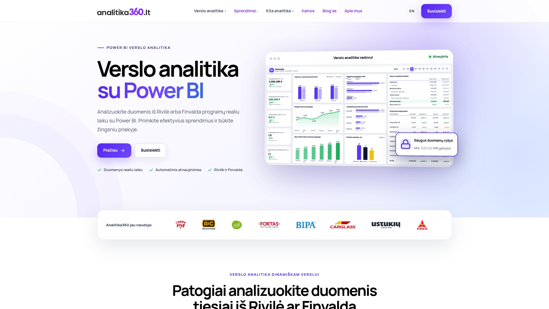
For businesses in every sector, from restaurant chains to logistics companies, the report structure is tailored to the specific metrics that matter most in that sector. If you would like to see how such a solution works for a particular business model, take a look at our business analytics solutions by sector and get in touch to arrange a short demonstration using a sample of your own data.
Sources
The technical side is best supported by the Microsoft Learn documentation on cash overview, while practical skills can be strengthened through Power BI training for finance professionals.
This article is general information, not a substitute for advice from a qualified financial adviser. Consult a qualified financial professional about your own circumstances before acting on anything here.
- Cash overview Power BI content - Finance
Frequently asked questions
How long does it take to implement a Power BI cash flow report?
Depending on how complex the data sources are, getting from the initial inventory to a working report can take anywhere from a few weeks to several months.
Can Power BI work with Rivilė and Finvalda data at the same time?
Yes. The connections to the two systems are built separately, because their export structures differ, but the final report can combine data from both sources in a single model.
Do you need programming skills to build cash flow reports?
For a basic report, DAX measures and the fundamentals of data modelling are enough, while a more complex forecast sometimes calls for Python or R skills or help from an analytics partner such as Analitika360.
How does a cash flow forecast in Power BI differ from calculations in Excel?
Power BI recalculates the forecast automatically every time the source data refreshes, whereas Excel usually requires the formulas to be updated manually each time.
What data is needed for the report to give an accurate picture of liquidity?
You need bank statements, invoice payment statuses, exchange rates for multi-currency transactions and a standardised chart of accounts mapping that links accounting logic with reporting logic.