See more. Decide better.
 Inventory Turnover in Power BI for Lithuanian Companies: From DAX to Decisions

Power BI is well suited to tracking inventory turnover, provided the data is prepared properly. The key metric is inventory turnover, calculated as COGS divided by average inventory value. The first step is to gather cost of goods sold (COGS) data and, having decided between an inventory snapshot or a movement fact structure, build the data model so that the calculations are correct every month.
In brief:
- Reliable company data and sound costing logic are essential to trustworthy, useful metrics; even the best visualisations cannot make up for errors in the data.
- When building the data model, the choice between a snapshot and a movement fact model should be driven by the precision you need in the calculations and whether you want to analyse the movements in between.
- The first priority should be making sure that inventory and cost data are accurate and consistently joined, because inaccurate data always distorts turnover figures.
- Power BI solutions that bring in data from Rivilė or Finvalda make it quicker and more accurate to monitor inventory turnover, DSI, SLOB and ABC segmentation.
- Effective inventory analytics covers not just the numbers but clear action plans too: slow-moving items start being discounted, or the supply strategy changes.
Contents
- Which KPIs to track: turnover, DSI, SLOB and ABC analysis
- Effective DAX for calculating turnover
- The data model: when to use a snapshot and when a movement fact
- Report design: visuals and UX that turn turnover metrics into action
- From metrics to decisions: concrete actions based on turnover results
- An Analitika360 example: how a Power BI inventory turnover solution is implemented
- What really needs doing first
- The Analitika360 Power BI package for inventory
- Sources
Which KPIs to track: turnover, DSI, SLOB and ABC analysis
Inventory analytics in Power BI rests on four metrics which, taken together, give the full picture.
Inventory turnover shows how many times inventory has ‘turned over’ during a period. The formula is COGS divided by average inventory value. The higher the figure, the more efficiently capital is moving through the warehouse rather than sitting on the shelves. Mecalux explains how this metric ties directly into warehouse planning and cost control.
Days of Supply (DSI) converts turnover into days: 360 (or 365) divided by turnover. The result answers a practical question: how many days will current stock last at the present rate of consumption?
ABC classification is based on the Pareto principle: A items typically account for around 80% of consumption value despite making up only a small share of the product range, as practical inventory analytics projects show. Combining ABC with turnover shows you which A items have low turnover, and these represent the greatest risk to your capital.
SLOB (slow-moving / dead stock) detection identifies items that have sat in the warehouse without movement for longer than a set threshold. In economic terms this is frozen capital plus storage costs, which often go unnoticed until someone looks at a dedicated dashboard.
- Inventory turnover – how fast capital moves through the warehouse
- DSI – how many days stock will last at current consumption
- ABC – where to focus management effort
- SLOB – where capital is sitting idle
Effective DAX for calculating turnover
A set of DAX measures for inventory turnover analysis usually consists of four core measures, which need adapting to the data structure of your particular ERP.
The Total COGS measure usually looks like this:
Total COGS = SUM(Sales[CostOfGoodsSold])If the data comes from a movement table, you will need to filter by movement type (for example, ‘Sale’ or ‘Issue’) so that returns or transfers between warehouses do not end up in the calculation.
The Avg Inventory measure is based on monthly snapshots rather than a single point-in-time balance:
Avg Inventory = AVERAGEX(VALUES('Calendar'[Month]), [Inventory Value])This approach smooths out seasonal fluctuations and gives a more stable denominator.
The Inventory Turnover measure combines the two:
Inventory Turnover = DIVIDE([Total COGS], [Avg Inventory], 0)The third DIVIDE argument returns 0 instead of an error when average inventory value is zero. The GCOM Solutions guide offers a similar version of the formula as a starting template, worth adapting to your own table names.
The Days of Supply measure:
Days of Supply = DIVIDE(360, [Inventory Turnover], 0)Some companies use 365 days instead of 360. The difference in the result is small, but it is important to stick to one convention across all reports.
The most common mistakes:
- the wrong cost field (selling price instead of unit cost)
- mixed currencies across warehouses in different countries
- different inventory valuation methods (FIFO vs average cost) used in the same model without a clear separation
The data model: when to use a snapshot and when a movement fact
The choice between a snapshot and a movement model determines what you will be able to calculate at all without having to rebuild things.
A snapshot model records the stock balance on a given day or at month end. It is simpler to build and quick to answer the question ‘how much do we have now’, but it struggles to show the true flow of consumption over a period, because it loses the information about the movements in between.
A movement fact model records every movement of an item: sales, receipts, transfers. This model allows you to calculate COGS and consumption value accurately for any period, because it separates snapshot and flow metrics the way they actually work in a real business.
The recommended star schema for inventory analytics:
- StockMovements – the fact table with every movement
- InventorySnapshots – periodic balances for control and comparison
- Products – the product dimension with category and supplier
- Warehouses – the warehouse dimension
- Calendar – the time dimension with a month and quarter hierarchy
The cost lookup table is best joined through a separate relationship with Products rather than directly via StockMovements, to avoid circular references between fact tables.
Report design: visuals and UX that turn turnover metrics into action
The best inventory dashboards do not overload the user with numbers; they show straight away where action is needed.
- KPI cards at the top – turnover, DSI, total inventory value, SLOB share as a percentage.
- Trend chart – turnover over 12 months, so you can see seasonality or a sudden drop.
- ABC Pareto chart – items ranked by consumption value with a cumulative line.
- Dead stock table – specific items, warehouses and days since the last movement.
The filtering logic should cover warehouse, category, supplier and period, and slicers should be synchronised across all pages so that users do not lose context when jumping from one view to another.
Alerts and conditional formatting should visually highlight problem items – for example, red for DSI above 90 days, or green when turnover meets the target.
Pro tip: Add a ‘Create PO’ button or link right next to the dead stock table or the low-stock items – it shortens the path from spotting a problem to acting on it to a few seconds rather than a few days.
Examples of visual design can be found in the Power BI report examples, which show what similar solutions look like in practice.
From metrics to decisions: concrete actions based on turnover results
A metric without action is just a number on a screen. High turnover often means processes are working well, but it is worth checking whether there is a stockout risk; if there is, increase safety stock and make sure suppliers are meeting the agreed lead times.
Low turnover signals surplus stock. Solutions:
- offer discounts so the item leaves the warehouse sooner
- review supply terms and reduce order batch sizes
- redirect stock to another warehouse or region where demand is higher
The reorder point and safety stock are set from average daily demand multiplied by the lead time, plus an additional buffer for risk. Organisationally, it is important to define who exactly monitors these KPIs and how quickly they respond to a red alert – without a clear SLA, the dashboard becomes merely a decorative screen.
An Analitika360 example: how a Power BI inventory turnover solution is implemented
Analitika360 implements Power BI solutions that integrate with the Rivilė and Finvalda accounting systems, automatically pulling in inventory, sales and expense data. Reports refresh without any extra input from the user – the client simply opens the dashboard and sees up-to-date figures.
A typical package covers inventory turnover, DSI, ABC classification and SLOB monitoring in one place, linked to profit and expense metrics. Restaurant chains and accounting firms using this solution get a single, consistent source of information rather than separate Excel files from each department.
What really needs doing first
Most managers start at the wrong end – they look for an attractive dashboard while the data model is still a mess. It should be the other way round. If the snapshot and movement data are not reconciled, even the finest visual will simply present the wrong number in an elegant way.
The usual advice – ‘just install Power BI and you will see your turnover’ – underestimates the hardest part: the cost lookup logic. If average inventory value does not reflect the unit cost for that period, the turnover figure may show growth that does not exist in reality. This is not a technical detail but a fundamental condition of whether the metric can be trusted at all.
I would prioritise not an extra KPI but the reliability of the data source. A single clean movement fact with correct costing logic delivers more value than ten visually attractive but inaccurate cards. Only once the foundation is solid is it worth investing in ABC segmentation, alerts and automated notifications.
— Analitika360
The Analitika360 Power BI package for inventory
Analitika360 is an alternative to building Power BI yourself from scratch – you do not need to spend months working out DAX syntax or tuning a data model by trial and error, as the solution arrives already configured for your inventory, sales and expense data.
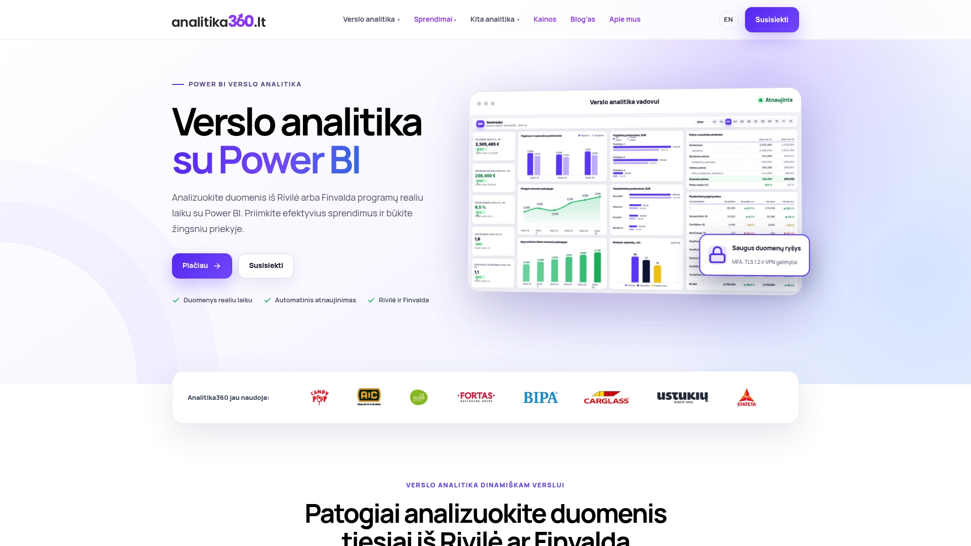
The package includes data integration from Rivilė, Finvalda, Excel or SharePoint, a ready-made dashboard with turnover, DSI, ABC and SLOB metrics, DAX measures tailored to your product structure, and automatic report refreshes with no extra action from the user. Implementation usually takes a few weeks, depending on the number of data sources and how tidy they are.
If you want to delve deeper into analytical methods before implementation, it is also worth looking at technical analysis in training courses.
Browse business analytics solutions by sector and get in touch for a free demo – the first step is a short conversation about your current data sources.
Sources
For further reading, a few sources are worth reviewing, as they complement this article with technical examples:
- Power BI calculations for inventory management (gcomsolutions)
- Inventory Analytics with Power BI: Stock, Turnover, and Demand | ECOSIRE