
Sales Funnel in Power BI: How to Model and Analyse It

Analysing a sales funnel in Power BI takes four things: the funnel chart visual, a star schema data model, a weighted pipeline value calculation and an RLS security layer. Together they let you see within minutes at which stage opportunities stall and what your open sales contracts are really worth. Power BI is a good fit when you have at least four sequential sales stages, and models of this kind can be supplied as standard packages integrated with Rivilė and Finvalda data.
In brief:
- Sales funnel analysis needs four elements: a visual, a data model, a weighted value calculation and a security layer.
- The funnel chart works best with at least four linked sales stages and data on each deal’s stage, date and value.
- The data model must be structured into fact and dimension tables so that calculations are accurate and fast.
- Clearly defined stages and a stored history let you calculate conversion rates and weighted pipeline value accurately from historical data.
- Automated data refresh is best handled through incremental refresh or Power BI Premium, while security is achieved by applying RLS and GDPR requirements.
Contents
- What a sales funnel is and when the Power BI funnel chart fits
- Data model: a star schema for sales funnel analysis
- KPIs and calculations: from opportunity count to weighted pipeline value
- Visualisation and interactivity: how the funnel chart works with other visuals
- Data refresh: choosing between incremental refresh and DirectQuery
- RLS and GDPR: protecting sales data within the law
- How Analitika360 delivers Power BI funnel solutions
- The author’s view: where to start and what to avoid
- Start with a ready-built Power BI funnel and no extra work
- Sources
- Frequently asked questions
What a sales funnel is and when the Power BI funnel chart fits
A sales funnel shows how many opportunities pass through each stage of the sales process, from first contact to closing the deal. Each stage reveals where customers stay, where they drop out and where salespeople spend time without result.
Power BI has a dedicated visual for this purpose, the funnel chart, which shows a sequence of stages, for example “Lead → Qualified → Proposal → Contract → Closed”, and automatically calculates the drop-off percentage between them. The visual works best when the process structure meets a few conditions:
- the sales process has at least four sequential stages, otherwise the shape does not reveal the real dynamics;
- the volume at the first stage differs significantly from the last, otherwise the chart looks shapeless;
- you have field data on stage, date and value for every opportunity.
Before building the report, check the export from your CRM or accounting system: does every deal have a specific stage assigned, along with the date it entered that stage? Without this information the funnel chart will show only a static picture, not the real dynamics of your sales.
Data model: a star schema for sales funnel analysis
An attractive visual cannot make up for a poor data model. The star schema principle requires the fact table to be kept separate from the dimension tables so that DAX calculations are accurate and fast.
A practical implementation plan looks like this:
- The fact table must have a consistent grain, usually one row per opportunity or one row per stage change date.
- Dimension tables (customer, salesperson, product, time) are kept separately and linked to the fact table through relationships.
- The StageOrder field must be numeric (1, 2, 3…), never text, otherwise Power BI sorts the stages alphabetically rather than in their logical order.
- Stage history must record every change, not just the current status, otherwise conversions between stages cannot be calculated accurately.
The most common mistake beginners make is calculating conversions from a deal’s current status while ignoring its history. If you do not record when an opportunity entered a stage and when it left, average time in stage simply cannot be calculated.
Pro tip: Create a separate “stage log” table with the fields OpportunityID, Stage, DateIn and DateOut. It is the only way to see precisely how many days a deal spent at each stage.

KPIs and calculations: from opportunity count to weighted pipeline value
The number of opportunities on its own tells you nothing about the real revenue outlook. The Opportunity Analysis sample shows that the largest number of opportunities at a particular stage does not always mean the highest likelihood of closing, so a funnel report needs to show several metrics together:
- Opportunity count — how many opportunities sit at each stage;
- Staged value — the total value of those opportunities, unadjusted;
- Factored revenue — the weighted value, calculated from the probability of closing;
- Conversion rate between adjacent stages;
- Drop rate — the drop-off percentage the funnel chart shows automatically;
- Average time in stage in days.
Weighted pipeline value (factored revenue) is calculated by multiplying the deal value by the probability assigned to its stage. The probability should be set from the company’s own historical closing data rather than general market averages.
Regions and sales channels differ from one another in how deals close, so applying the same probability to every opportunity produces a distorted forecast.
In practice this means that if contracts at the “Proposal” stage closed in 40% of cases over the past 12 months, you should use a factor of 0.4 for that stage, not a general industry average taken from an online article.
Visualisation and interactivity: how the funnel chart works with other visuals
The funnel chart shows the shape on its own, but not the causes. To identify which salesperson, region or product is driving the drop-off, the funnel needs to be linked to other visuals.
- In the fields pane, set Category = SalesStage and Values = Opportunity Count or Factored Revenue, depending on whether you are analysing volume or money.
- Add a bar chart or treemap by salesperson or region and turn on cross-filtering, so that clicking a funnel stage automatically updates the segment view.
- Configure the tooltip to show not just the value but also the drop rate, average time in stage and opportunity count at a glance.
- Turn on a multi-select filter by period so you can compare this quarter’s funnel with the previous one.
- Check the StageOrder sorting in the report’s reading view, because the wrong order immediately ruins the whole interpretation.
The shape of the funnel chart is a diagnostic signal, not the final answer. The analyst’s job is to link a persistent drop-off to a specific salesperson, product or season, and that requires cross-filtering between several visuals on one page.
Data refresh: choosing between incremental refresh and DirectQuery
For large sales fact tables, a full refresh every time is wasteful. Incremental refresh lets you update only new or changed records without reloading the entire history.
- Configure the RangeStart and RangeEnd parameters in the Power Query filters; they define which data period counts as “fresh”.
- The first full refresh loads the entire history, and each subsequent refresh processes only the selected period window, usually the last few days or months.
- A DirectQuery partition lets you see data in real time, but it is a Premium feature that requires more capacity and involves trade-offs in query speed.
- Before deploying to production, test the initial refresh separately from the partition strategy to avoid errors from overlapping periods.
The choice between incremental refresh and DirectQuery depends on your budget and how quickly you need new deals to appear in the report.
RLS and GDPR: protecting sales data within the law
Sales reports often show personal data, such as customer names, salesperson performance and contact details, which makes RLS (row-level security) an essential rather than optional element.
- Choose between static roles (a fixed filter for each group) and dynamic roles (a filter based on the identity of the signed-in user).
- Make sure the relationships in the model between fact and dimension tables are active, otherwise the filter will not propagate and salespeople will see other people’s data.
- Test each role separately with realistic scenarios; systematic testing is the only way to confirm the security rules work correctly.
- Under the GDPR, the lawful basis for processing is usually a contract or legitimate interest, while direct marketing requires separate consent.
Pro tip: Minimise the amount of personal data in the report. If the sales analysis only needs the salesperson’s name and the stage, do not show customers’ phone numbers or email addresses on the report page.
How Analitika360 delivers Power BI funnel solutions
Data from the Rivilė and Finvalda accounting systems can be integrated directly into the Power BI model, together with additional sources such as SharePoint, Excel or a CRM system. Reports are often configured to refresh automatically without ongoing user involvement, ensuring an up-to-date view of the funnel throughout the working week.
Implementation usually follows three steps:
- Data inventory — checking which fields (stage, date, value, salesperson) exist in the Rivilė or Finvalda system.
- Stage definition — agreeing with the client exactly what each sales stage is called and in what order they come.
- Model preparation — building the star schema model, integrating additional sources and configuring automatic refresh.
This process works both for ready-built report packages and for bespoke projects where a company’s sales process is non-standard.
The author’s view: where to start and what to avoid
The first step is to agree on stage names and run a 30–90 day cohort test, not to perfect the model straight away. Avoid copying general market conversion rates and never skip stage history records; without them, the funnel lies.
— Analitika360
Start with a ready-built Power BI funnel and no extra work
Once the sales funnel model is set up correctly, the remaining problem is usually time: nobody has the time to build it from scratch. Analitika360 takes a different approach from building the model yourself: the Rivilė Basic package costs €59 a month and automatically integrates your sales data into a ready-built Power BI report, while the Finvalda Basic package does the same for Finvalda users at the same price.
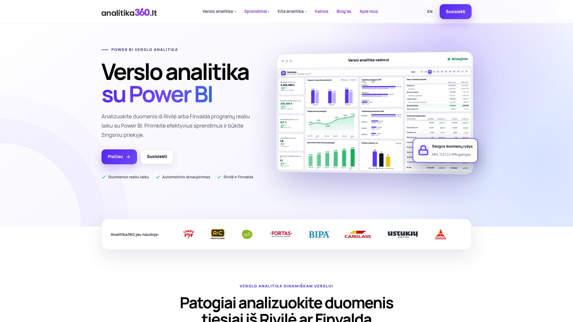
If your sales process is non-standard or you need to integrate several sources at once, bespoke projects cost €70 an hour and include a full data inventory, stage definition and model preparation tailored to your processes. After you get in touch, there is first a brief assessment of your data sources, then the funnel stages are agreed, and by the end of implementation the report is already refreshing automatically. Contact us for a concrete implementation plan for your sales data.
Frequently asked questions
How many stages does a Power BI funnel chart need to be useful?
The funnel chart works best when the sales process has at least four sequential stages. With fewer stages the chart loses its diagnostic value, because the shape of the drop-off becomes uninformative.
What is weighted pipeline value and how is it calculated?
Weighted pipeline value, or factored revenue, is obtained by multiplying the deal value by the probability percentage for its stage. The probability is best set from your own company’s historical closing data, not from general market averages.
Why do you need a star schema model rather than one large table?
A star schema separates fact and dimension tables, so DAX calculations run faster and more accurately. A single large table often produces incorrect conversion figures because it lacks a consistent grain.
How much does a ready-built Power BI funnel package from Analitika360 cost?
The Rivilė Basic and Finvalda Basic packages cost €59 a month each, while the more advanced Rivilė PRO or Finvalda PRO option costs €89 a month. Bespoke projects are charged at €70 an hour.
Can Power BI show the sales funnel in real time?
Yes, using a DirectQuery partition, but this requires Power BI Premium capacity. In most cases a more efficient solution is incremental refresh with scheduled updates several times a day.