
Data Quality Monitoring in Power BI: A Checklist for Analysts

To make sure your Power BI reports can be trusted, put proactive monitoring in place across three layers: data profiling in Power Query, a semantic model audit using DMVs and Query Diagnostics, and automated alerts via the Power BI REST API and Azure Log Analytics. Together, these three layers make up data quality monitoring in Power BI that catches errors before users do. The approach can be built into ready-made report packages, so your team does not have to start the project from scratch.
In brief:
- Before you get to the reports, settle on a simple quality checklist that lets you quickly assess critical issues.
- Power Query profiling shows errors, inaccuracies and the percentage of duplicates, although large data volumes can slow the process down.
- For the semantic model audit, use DMVs, Azure Log Analytics and the Power BI Performance Analyzer to pinpoint model and query performance problems.
- Automated alerts on schema changes, volume anomalies, schedule delays and stale data help you respond to problems promptly.
- A quick start with ready-built report packages costs around €59 a month, while bespoke projects start from €70 an hour, depending on your requirements.
Contents
- A quick quality checklist for your Power BI solution
- Data profiling in Power Query: what to use and how to interpret it
- Semantic model auditing and log analysis
- Automated monitoring and anomaly detection
- Validation and testing before deployment
- A data quality report in Power BI: what to show on the dashboard
- Putting it into practice: how Analitika360 implements proactive monitoring
- Editor’s view: proactive monitoring versus reactive auditing
- How Analitika360 can help you implement data quality monitoring
- Sources
- FAQ
A quick quality checklist for your Power BI solution
Before diving into the technical mechanisms, it is worth having a checklist you can run through in 5–10 minutes before every important report. It works as a first-pass triage: it tells you whether a problem is critical or can wait until the next refresh cycle.
- Profiling: does column quality show more than 1–2% errors or empty values in the table?
- Row count: does the latest refresh deviate by more than 15% from last week’s median?
- Watermark (freshness): does the most recent date in the table match what you expect (e.g. yesterday’s data)?
- Schema comparison: has the table structure, column types or column names changed?
- Refresh duration: did the refresh take significantly longer than usual?
- DAX/query diagnostics: is a particular visual or query responding more slowly than before?
When any item falls short of expectations, an alert should go automatically to the team’s Teams channel or by email, with a named person responsible. Without a clearly assigned owner, such alerts simply pile up unread.
Data profiling in Power Query: what to use and how to interpret it
Power Query has three built-in profiling tools: column quality, column distribution and column profile. They appear as cards above the data pane once you switch on profiling from the ‘View’ menu. By default, profiling only covers the first 1,000 rows, so the Microsoft documentation advises checking the setting at the bottom of the screen and switching it to the entire dataset when data volumes allow.
How to interpret the results:
- Error shows records whose type or formula causes a calculation error, most often due to an incorrect type conversion.
- Empty shows blank values, which may point to missing data in the source system.
- A Valid percentage below 95% usually signals a problematic group of columns that should be checked first.
- The ratio of distinct to unique values helps you spot when a key column unexpectedly contains duplicates.
Pro tip: When a dataset has millions of rows, profiling the whole table can slow down the Power Query Editor. It is worth profiling a representative sample (e.g. the last three months) and checking the full table only once you find an anomaly.
When profiling shows a recurring problem in the same source, it makes sense to fix it not in the report but in the original source or the ETL step; otherwise the error will reappear with every refresh cycle.
Semantic model auditing and log analysis
Data profiling shows what is happening inside a table, but not what is happening at the model or query level. That calls for a different set of tools. Microsoft’s implementation guidance recommends dynamic management views (DMVs), semantic model trace events and Azure Log Analytics as the core toolkit for documenting and optimising a model.
In practice, these tools serve different purposes:
- DMVs let you extract metadata on columns, relationships and memory consumption via DAX Studio or SSMS.
- Performance Analyzer in Power BI Desktop shows how long each visual takes and how much of that time is spent on the DAX query and how much on rendering the visual itself.
- Query Diagnostics is useful when it is not the whole report that loads slowly, but a specific Power Query step during transformation.
- Azure Log Analytics collects detailed semantic model events over a longer period, making it suited not to one-off diagnostics but to continuous monitoring.
What to look for specifically: unused columns that only inflate the model size; tables that consume a disproportionate amount of memory relative to their value in the report; and DAX measures whose execution time exceeds a few seconds per visual. These three signals usually explain why a report ‘runs slowly’ even though the formal refresh status shows success.
Automated monitoring and anomaly detection
A ‘successful’ refresh status is not enough. Data can refresh without errors yet have completely wrong content if the source system itself returned an empty or incomplete dataset. An analysis of monitoring beyond refresh status identifies four signals that, together, catch most of these silent errors:
- Schema change — the table structure, types or names differ from the previous cycle.
- Volume anomaly — the row count deviates from the historical norm.
- Schedule drift — the refresh happened at the wrong time or did not happen at all.
- Watermark — the date of the most recent record does not match expectations, meaning the data is stale.
A volume baseline works best when it is calculated as the median for each day of the week over several weeks. That much historical data is usually enough to detect meaningful deviations, as it accounts for weekend and seasonal fluctuations.
When one of the four signals fires, the process should follow a clear hierarchy: first, an automatic alert to the responsible analyst; then a quick triage (is this a one-off anomaly or a systemic problem?); next, a temporary fix (e.g. flagging the report as ‘source out of date’); and finally, a root cause analysis together with the data source administrator.
Validation and testing before deployment
Monitoring in production is no substitute for testing before deployment. Microsoft’s content validation guidance recommends several stages: development (dev), testing (test), user acceptance testing (UAT) and peer review before promotion to production.
- Manual testing suits new measures and visuals, where human judgement is needed on whether a figure ‘looks right’.
- Automated tests (sanity checks, regression tests) should verify fixed points: whether the overall total matches the source system, and whether key KPIs drop to a negative value where business logic makes that impossible.
- Peer review reduces the risk of authors missing their own mistakes in a DAX formula.
- UAT with real business users uncovers discrepancies that technical testing misses, such as incorrect terminology in the report.
The conditions and success criteria for each test should be written down, not just carried out informally. That way, a month or two later, you can answer the question of exactly what was checked before go-live.
A data quality report in Power BI: what to show on the dashboard
It is worth turning the profiling and monitoring results into a dedicated quality report rather than leaving them in internal logs. A practical example shows how to import profiling results into Power BI and build a single-page quality dashboard.
The core of such a dashboard consists of:
- Cards at the top: number of stale tables, number of invalid rows, number of active alerts.
- A warning grid with drill-through to a specific table or group of columns.
- Trend charts for each key quality metric over time, not just the current status.
- History tracking via a snapshot table: a new set of rows is written at every refresh, so you can see how quality has changed over weeks rather than at a single point in time.
Pro tip: Use conditional formatting so that cards automatically change colour from green to amber and red according to a predefined threshold. That way a manager grasps the situation in a second without digging into the figures.
A dashboard like this works well when historical data is accumulated in a separate table (using a CDC or snapshot approach), because a one-off ‘current state’ view does not show whether a problem is growing or shrinking.
Putting it into practice: how Analitika360 implements proactive monitoring
In a real project, the sequence of steps usually looks like this: first, all data sources and tables are inventoried; second, specific metrics are defined (row count, watermark, schema); third, continuous monitoring is put in place; fourth, alerts are configured; fifth, a remediation cycle is set up with named owners.

Analitika360 adapts this process to Rivilė and Finvalda data in advance, as the report packages already have built-in data refresh logic that requires no extra user intervention. A client starting with a ready-built package gets not only revenue, cost and profit tracking but also a model already aligned with the typical data source quirks of these systems. In a bespoke project, the same logic is applied to the company’s existing IT infrastructure, including SharePoint or CRM sources.
Editor’s view: proactive monitoring versus reactive auditing
Most teams check data quality when a manager spots a wrong figure in a report. That is a reactive model, and it costs trust. Proactive monitoring with baseline thresholds and alerts lets you spot a problem within an hour rather than a week, by which time it has already affected a decision. It is worth starting with a single critical data source rather than the whole system at once.
— Analitika360
How Analitika360 can help you implement data quality monitoring
The traditional route to data quality monitoring involves months of project work: writing profiling rules, building DMV queries and configuring alerts from scratch. Analitika360 shortens that route with its ready-built Rivilė Basic and Finvalda Basic report packages at €59 a month, with automatic data refresh and core quality logic already in place.
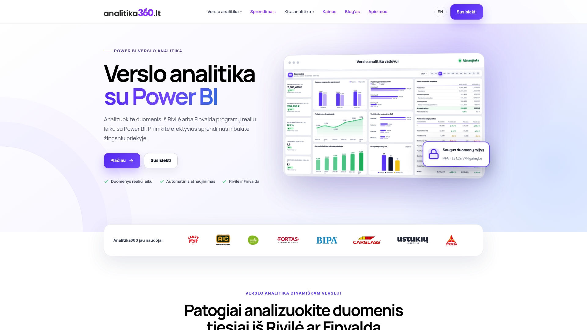
For companies that need deeper analysis or sales and inventory metrics, the Rivilė PRO or Finvalda PRO plan at €89 a month is a good fit. When requirements go beyond a standard package, for example combining several sources or adapting the model to a specific business process, Analitika360 offers bespoke projects at €70 an hour; see the pricing page. Microsoft Pro or Premium licences can also be purchased through a reseller.
Want to start with a concrete step? Order a Rivilė or Finvalda report package, or get in touch about a bespoke project via the Power BI implementation page.
Sources
- data-profiling-tools
- Power BI monitoring beyond refreshes
- Power BI to visualize and profile data for data quality
FAQ
What is data quality monitoring in Power BI?
It is an ongoing process that tracks the accuracy, freshness and structural stability of data in Power BI reports, not just whether the refresh succeeded. It consists of profiling at the Power Query level, a semantic model audit and automated alerts on anomalies.
Why does a successful refresh not mean the data is correct?
A refresh can complete successfully even when the source system returns an empty, duplicated or incomplete dataset, because Power BI natively checks only that the refresh took place, not the meaning of the content, as an observability analysis points out. Such silent errors are caught only by separate monitoring signals, such as row count or watermark checks.
What tools are needed for a semantic model audit?
The core toolkit consists of DMV queries, semantic model trace events, Query Diagnostics, Performance Analyzer and Azure Log Analytics for long-term data collection, as Microsoft’s guidance sets out. Together, these tools let you find both model errors and performance problems.
How much does it cost to get started with data quality monitoring from Analitika360?
A ready-built Rivilė or Finvalda Basic report package with automatic refresh costs €59 a month, while the broader PRO package with additional metrics costs €89 a month. Bespoke projects are charged at €70 an hour.
How often should data quality checks take place?
Automated alerts should fire after every refresh cycle, checking for schema changes, volume anomalies and watermark freshness. Deeper profiling and semantic model audits are usually carried out less often, for example once a week or after every significant model change.