Your business in 360°
 Financial control dashboards: how they help you manage your company's money

A financial control dashboard is a visual tool for managing a company’s financial indicators. It shows revenue, costs and profit in real time, so you can make decisions quickly. It brings data from your accounting systems together on a single screen, which means a manager no longer has to wait for the month-end report to see where the company stands. We offer solutions tailored to Rivilė and Finvalda users.
In brief:
- Show no more than six KPI cards in the top row, covering revenue, costs, profit, cash flow, the balance sheet and outstanding balances, and leave the detail further down.
- Power BI exports are limited to 30,000 rows in CSV format and 150,000 rows in XLSX format, so handle large datasets through summaries or filters.
- Start with a single department. Clean up the accounting data and standardise the chart of accounts and tags, then test the dashboard on real data before rolling it out across the company.
- Restrict access to financial data by employee role, and review export permissions regularly, at least once a quarter, especially when the team changes.
- Review cash flow weekly and profit and costs monthly, and give any deviation that persists for three months a named owner and a deadline for resolving it.
Contents
- Which KPIs belong at the top of the dashboard?
- How to connect Rivilė, Finvalda, Excel and SharePoint to Power BI
- Implementation steps: from requirements to a working dashboard
- Good practices that deliver value faster
- Data security and access management in the dashboard
- How to turn dashboard data into an action plan
- The Analitika360 perspective on financial control dashboards
- How Analitika360 helps you implement a financial control dashboard
- FAQ
- Sources
Which KPIs belong at the top of the dashboard?
A well-designed dashboard does not swamp a manager with information. The key figures should be visible within the first three seconds. The indicators placed at the top are the ones that directly answer the question ‘is everything all right today?’, while more detailed analysis sits further down.
The core financial KPIs worth showing at the top of the dashboard are:
- Revenue for the period, compared with the previous period and with the plan.
- Costs by category, so you can see where spending is rising.
- Profit (gross and net), because this is what shows the business’s real result.
- Cash flow, which reveals whether the company has enough liquidity.
- A balance sheet summary: assets, liabilities and equity.
- Receivables and payables, so it is clear who owes what to whom.
The recommended layout has three levels. KPI cards with the headline figures go at the top, trend charts covering the last few months sit in the middle, and detailed filters and tables for deeper analysis go at the bottom. This ‘pyramid’ principle lets a manager get the overall picture within a few seconds, while an accountant who needs a specific account can drill down to the detail without having to ask for it. Filters by period, department or project should apply across the whole dashboard at once, and the figures should update automatically whenever the filter combination changes.
Pro tip: Do not show more than six KPI cards in the top row. Any more slows reading down rather than speeding it up.
You will find specific formulas and worked examples in our article on KPIs for finance, and if you are setting up cash flow indicators, our guide to cash flow analysis is worth a look.
How to connect Rivilė, Finvalda, Excel and SharePoint to Power BI
The technical side of a dashboard usually raises the most questions, because the data lives in different systems and in different formats. Power BI lets you combine all these sources into a single model, but this needs careful preparation.
- The main registers are extracted from Rivilė and Finvalda: sales, purchases, the balance sheet and stock balances, usually through exported tables or a direct database connection.
- SharePoint and Excel serve as additional sources for data that the accounting system does not capture, such as budgets, forecasts and manual adjustments.
- All sources are modelled against a common time axis and a single chart of accounts, so that the figures match across tables.
- An automatic refresh schedule is set up, so the dashboard receives new data without anyone having to step in.
Before connecting the sources, it pays to align timestamps, currency conversions and chart of accounts names in advance, because these mismatches are the most common cause of model errors. Power BI also has practical export limits: up to 30,000 rows when exporting to CSV and up to 150,000 rows to XLSX. Large datasets are therefore better handled through summary tables or filters applied in advance, as described in the Microsoft Power BI documentation. The European Banking Authority (EBA) user guide describes similar filtering and export principles for institutional Power BI reports, where the EDAP visualisation tools let users filter reports and export data along the same lines. For examples of balance sheet data integration, see our Finvalda balance sheet analysis guide and our article on Rivilė balance sheet analysis.
Implementation steps: from requirements to a working dashboard
Implementing a dashboard is an organisational project as well as a technical one. Success depends on how well the requirements are defined at the outset and how carefully the data is prepared.
- Decide who the dashboard is for. A manager needs an overview and an accountant needs detail, so the priorities and the set of KPIs differ by audience.
- Clean up the data in Rivilė or Finvalda: standardise the chart of accounts, remove duplicates and check that every department is tagged in the same way.
- Build the data model in Power BI and write the KPI formulas so that they can be reused for other departments or periods.
- Test the dashboard with real data and train the team, and only then put it into everyday use.
Before you start, it is worth assessing how digitally ready the company is. Under the definition used in Eurostat’s Digital Intensity Index, a basic level of digital intensity generally means that a company uses at least four of twelve specified technologies. This indicator gives you a quick sense of how much extra work the infrastructure and training will need before an analytics solution is introduced.
Pro tip: Start with one department or one set of KPIs rather than a company-wide dashboard straight away. That makes it easier to spot and fix data errors.
For examples of implementing budget comparison KPIs, see our article on budget comparison in Power BI, and once your data volumes grow, it is worth reading about when you need a separate data warehouse.
Good practices that deliver value faster
A dashboard only delivers real value when its data is interpreted consistently and in context. A few principles help you avoid the most common mistakes.
- Standardise KPI formulas and periods across all reports, so the figures do not change depending on who is looking at them.
- Include contextual data: seasonality, POS sales information and external indicators such as weather forecasts in the food sector.
- Measure not only the financial results but also the dashboard’s own impact: how much time is saved preparing reports and how much faster decisions are made.
Experience shows that bringing in additional data sources, such as weather forecasts or calendar events, can noticeably improve sales forecasts in the food sector. A digital transformation case study demonstrated this, with overproduction cut significantly once additional data was integrated. The same principles apply to logistics and retail companies that combine POS data with financial analysis, as described in our guide to POS and Power BI integration.
Data security and access management in the dashboard
Financial data is the most sensitive part of a company’s information, so access management has to be planned before the dashboard is rolled out, not bolted on afterwards. Role-based access is recommended: the managing director sees the whole company, a department head sees only their own department’s data, and an accountant has access to the detail they need for their work.

Power BI supports row-level security, where the same dashboard shows different users different data according to their role, without creating separate reports for each group. This reduces the risk of errors and makes the reports easier to maintain. The EBA user guide takes a similar approach, describing how institutional Power BI reports combine filtering with controlled access to data, as set out in the EDAP report user guidelines.
It is also worth reviewing regularly who has access to the export functions, because exported data can leave the controlled environment and end up anywhere. Access rights should be reviewed at least once a quarter, especially when the team or the organisational structure changes. Security checks matter even more when the dashboard combines data from several sources, such as Rivilė, Finvalda and SharePoint, because each additional source is one more point that needs protecting.
How to turn dashboard data into an action plan
The dashboard does not make decisions for the manager, but it can turn intuition into an evidence-based action plan if the data is read systematically. The first step is a regular review rhythm: a weekly review of cash flow and a monthly analysis of profit and costs.
Every significant deviation from the plan should have a named owner and a deadline for investigating it. For example, if costs in a particular category exceed the plan by more than the agreed threshold, the department head provides an explanation and a proposed correction within a week. This process turns the dashboard from a monitoring tool into a management tool.
The action plan should also be based on trends rather than one-off figures. A deviation in a single month may be a fluke, but a trend lasting three months calls for a decision. That is why the dashboard’s charts should show at least several months of history rather than just a snapshot of the latest period. Automated report refresh helps directly here: when the data updates without manual intervention, the team spends less time preparing the figures and more time interpreting them and making decisions.

The Analitika360 perspective on financial control dashboards
Working with Rivilė and Finvalda users, we see that the biggest benefit comes not from the dashboard’s design but from automatic data refresh. For restaurant chains, this means spotting sooner when costs drift away from the plan, and for accounting firms working with several clients, the dashboard cuts down the manual work of preparing reports.
— Analitika360
How Analitika360 helps you implement a financial control dashboard
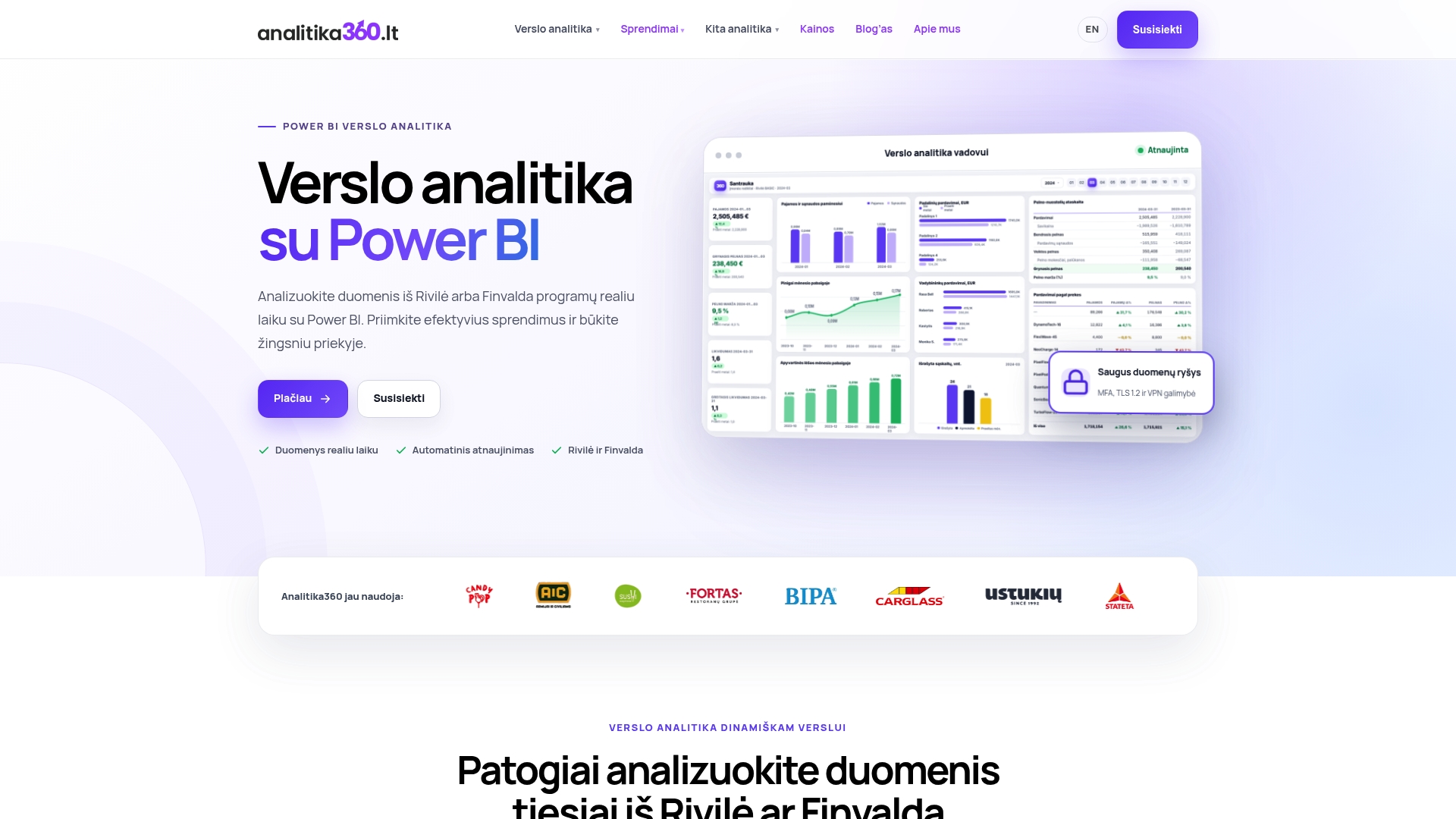
We offer ready-built Power BI report packages tailored to Rivilė and Finvalda users, so your dashboard is up and running without a lengthy build from scratch. The Rivilė Basic and Finvalda Basic packages for Rivilė and Finvalda users cover the core financial KPIs, while the PRO versions are designed for those who need deeper analysis. Where business processes or existing IT systems call for bespoke work, we offer custom projects at an hourly rate.
Automated report refresh means that once the data sources have been configured, the dashboard updates itself, with no extra work each month. If you would like to see how this would work in your company, take a look at our package prices and features or get in touch about a custom solution.
FAQ
What is a financial control dashboard and who is it for?
A financial control dashboard is a visual tool that shows the key financial indicators, such as revenue, costs and profit, in one place. It is designed for managing directors, finance managers and accountants who need to assess the state of the business quickly without preparing reports by hand.
Which data sources can be combined in a Power BI dashboard?
Power BI can combine data from accounting systems such as Rivilė and Finvalda, as well as from Excel files, SharePoint and other sources such as CRM or logistics systems. All sources are modelled against a common time axis so that the figures match across different reports.
How much does it cost to implement a financial control dashboard?
Ready-built packages such as Rivilė Basic or Finvalda Basic cost €59 a month, while the PRO versions, such as Rivilė PRO and Finvalda PRO, cost €89 a month. Custom projects are charged at €70 an hour, depending on the scope of the solution.
How can sensitive financial data be protected in the dashboard?
Financial data is protected by setting up role-based access, so that different users see only the information relevant to them. Power BI’s row-level security feature lets you apply these restrictions within a single dashboard, without creating separate reports for each group.
How long does it take to implement a dashboard from start to launch?
How long implementation takes depends on how clean the data is and how many integrations are needed, but ready-built packages let you start using the dashboard sooner than building a solution from scratch. Most of the time usually goes on cleaning the data and standardising the chart of accounts before modelling begins.
Sources
- Eurostat — Glossary: Digital Intensity Index (DII)
- EBA — User Guide: EDAP visualisation tools for Pillar 3 reports
- Microsoft Learn — Power BI visualization export data (documentation)
- European Digital Innovation Hubs — Brotsüchtig supply chain optimisation