See more. Decide better.
 Profit and loss statement: several years compared in one table

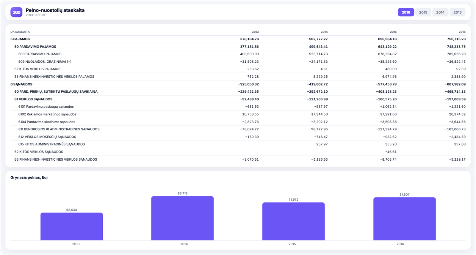
Most companies see their profit and loss statement once a year, usually when it is too late to change anything. In Power BI it is available whenever you need it, and, most importantly, several years of figures sit side by side in a single table.
Which decisions it helps you make
- Is performance improving? Several years’ columns side by side reveal a trend rather than a one-off figure.
- Which line item is moving the result? Drill-down shows whether profit was eaten up by cost of sales or by administrative expenses.
- What to expect from the full-year result. The trend in net profit over several years is a more realistic basis for planning than a single year’s figure.
- How to prepare for a meeting with a bank or investor. A structured statement with the detail behind it answers questions on the spot.
What you see in the report
- a profit and loss statement based on summary general ledger accounts;
- the option to break each summary line down into its detailed accounts;
- several years compared on one screen;
- the trend in selected line items over several years;
- a chart of net profit by year;
- convenient filtering, with filters easily reset to their default state.
How to read this report
The most useful view is not the absolute figures but each line as a share of revenue. If cost of sales was 61% of revenue last year and 67% this year, that matters more than the fact that profit looks similar.
If you need to compare two specific periods rather than years, for example before and after a marketing campaign, there is a separate period comparison report for that, included in the PRO package.
Vertical analysis: every line as a share of revenue
This is a method banks and investors use, but companies rarely do. Each line of the profit and loss statement is expressed as a percentage of revenue:
| Line item | 2024 | 2025 | 2026 |
|---|---|---|---|
| Sales revenue | 100% | 100% | 100% |
| Cost of sales | 61% | 64% | 67% |
| Gross profit | 39% | 36% | 33% |
| Operating expenses | 28% | 27% | 27% |
| Net profit | 8% | 6% | 4% |
In absolute terms a company like this may look as though it is growing, with turnover rising every year. In percentage terms it is clear that cost of sales has quietly eaten away a third of the profit over three years, while operating expenses have nothing to do with it.
That is exactly why it pays to look at shares rather than totals: totals grow along with turnover and hide the trend.
Three years is the minimum
One year shows a result. Two show a change. Only three show whether it is a trend or a one-off.
In practice this matters, because many decisions are taken after a single poor quarter. A multi-year table often shows that the same quarter is weak every year, and then it becomes a question of planning rather than a crisis.
Who outside the company finds this report useful
A profit and loss statement with a multi-year comparison and drill-down is the first thing a bank asks for when considering financing, a buyer when valuing the company, or an auditor.
With it ready to hand, the conversation goes differently: the question “why did administrative expenses rise in 2025?” is answered straight away by expanding the line, rather than with a promise to “get the data ready next week”.
The overall financial position at the same point in time is shown by the balance sheet, and the structure of profit in more detail by profit analysis.
How to get this report
The profit and loss statement is included in the Rivilė PRO and Finvalda PRO packages. You can compare plans on the pricing page.