See more. Decide better.
 Revenue and Expense Variance Analysis: What Changed and Why

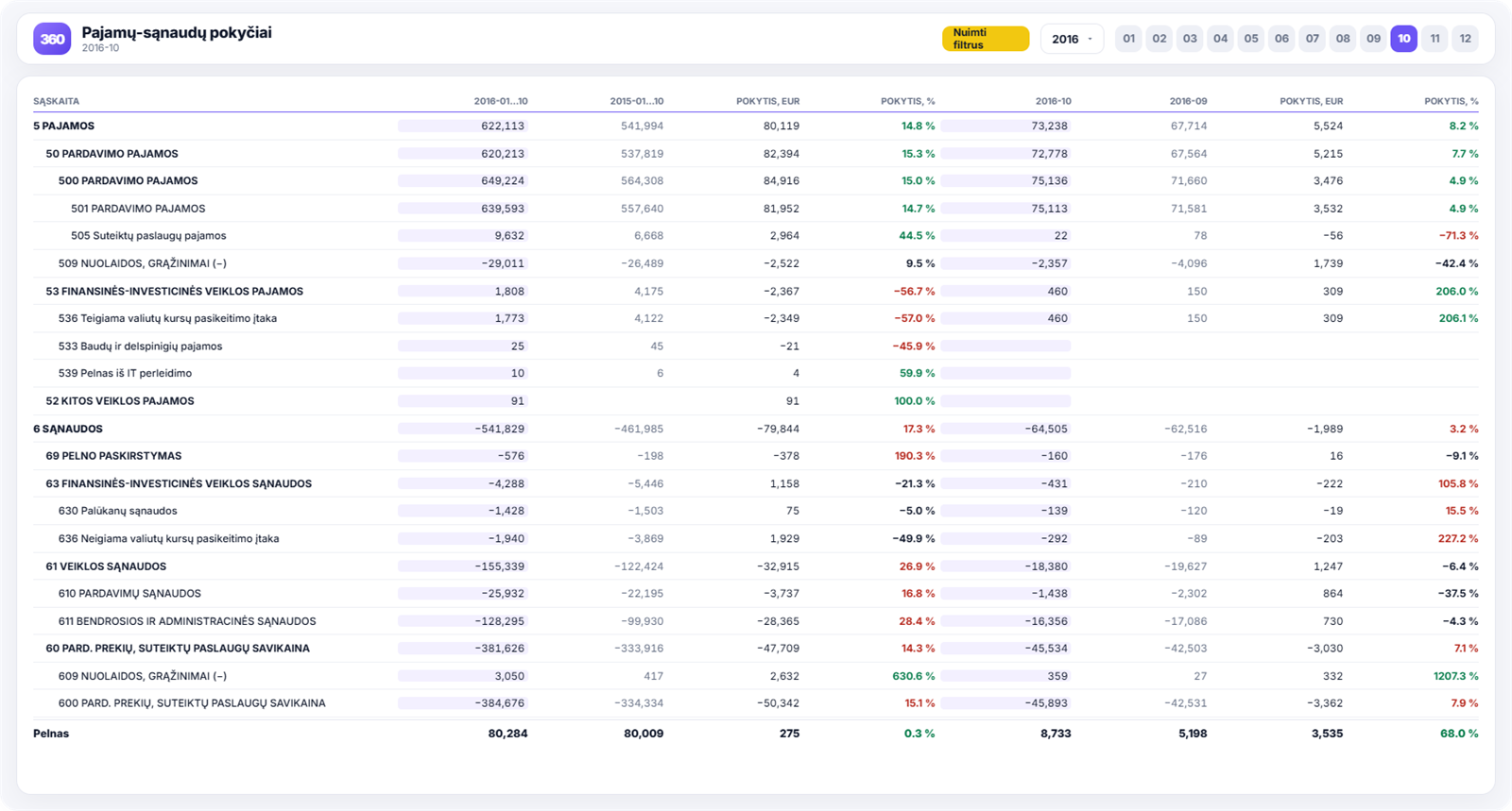
Looking at revenue and expenses on their own, it is hard to spot changes: you have to remember what the figures were last year. The variance report does that for you: it sets the chosen period against the same period last year and against the previous month, showing the difference in euros and in percentages.
Which decisions it helps you make
- What to act on first. Accounts are ranked by the size of the change, so you can see straight away where the biggest movements happened.
- Whether a change is a one-off or a trend. Monthly and annual views in a single table let you tell a random blip from a genuine direction.
- Where the margin is going. When revenue grows by 10% but cost of sales by 18%, the cause shows up in a specific account.
- Whether decisions paid off. After changing prices or suppliers, you see the real impact in figures.
What you see in the report
- revenue and expense balances by general ledger account;
- a comparison with the same period last year;
- a comparison with the previous month;
- the change in euros and in percentages for every line;
- summary accounts that can be broken down to detailed accounts;
- a profit line summarising the overall result.
How to read this report
A percentage change without context is misleading: 200% growth from a small base is often insignificant. So look at both columns together — the change in euros and the change in percentages. The changes that matter are the ones that are large on both measures.
Second, it is worth starting with the expense side. Everyone usually notices swings in revenue, but few spot an expense line that is quietly creeping up.
Why compare with last year rather than last month
In most businesses months are not comparable with one another: January will never look like December, nor summer like autumn. When you compare with the previous month, most of the change is down to seasonality rather than management decisions.
Comparing with the same month last year removes seasonality: if this March is weaker than last March, that is a signal, not the calendar.
That is why the report includes both views. The annual one answers the question “are we moving forward?”, the monthly one “has something just happened?”.
A practical example
A company notices that profit has fallen over the year even though sales have grown. In the variance table, accounts are ranked by the change in euros, and the picture becomes clear within a minute:
- sales revenue: +€180k (+12%);
- cost of goods sold: +€165k (+19%);
- transport costs: +€34k (+41%).
Cost of sales is growing faster than revenue, which means either purchases have become more expensive or goods are being sold at bigger discounts. The next step is the product analysis, where the specific product group is identified.
Without a table like this, the same answer would take several days of exports to Excel.
What to look at every month
In practice, three things are enough: the biggest change on the expense side, the biggest change on the revenue side and the overall profit line. If all three can be explained, the month is closed.
The variance report works well alongside expense analytics: the first shows what changed, the second within which structure it happened.
How to get this report
Variance analysis is included in the Rivilė PRO and Finvalda PRO report packages. You will find a comparison of all plans on the pricing page.