Your business in 360°
 Route Analysis in Power BI: From Data to Animation in Logistics

The best way to visualise routes in Power BI is to use the Azure Maps Path layer with properly prepared Path ID and Point Order fields. Every point on a route needs a latitude and longitude, and for animation it also needs a timestamp. Below we give a Power Query Unpivot example and some guidance on time-based animation.
In brief:
- In Power Query, unpivot the start and end coordinates into rows, use an index to create a route ID, and assign order numbers 1 and 2 to the two ends.
- Sort the points by time so that each route’s sequence is consistent, with no gaps or duplicates, and the line does not jump across the map.
- If coordinates are stored as integers, check their scale and divide by 1,000,000 if necessary, and make sure latitude and longitude have not been swapped.
- For animation, convert the timestamp to a date/time type, relate a time table to the route data table and set one position per interval.
- Test a single route first and only expand the dataset once you have checked its geometry, because animation does not fix an incorrect point sequence or wrong coordinates.
Contents
- Where the Path layer beats other map visuals
- How to prepare the data: Path ID, Point Order, coordinates and time
- How to configure the Azure Maps Path layer in a report
- How to add a time dimension and animate routes
- Common mistakes and Path layer limitations
- Quick checklist from import to publishing
- When a professional implementation saves time
- Editor’s view: start with the data, not the map
- We can help you implement route analysis on your data
- Frequently asked questions
- Sources
Where the Path layer beats other map visuals
Power BI offers several mapping options, and they are clearly described in the map visualisations overview. The main ones are:
- The Azure Maps visual includes bubble, 3D bar, heat map, filled area, marker, Path and reference layers.
- The filled (shape/fill) map can work well for comparing regions, whereas the Path layer is designed for visualising routes.
- The ArcGIS visual can be useful for more complex spatial analysis; to visualise a route sequence, choose the Path layer.
Simple markers show where a vehicle was, but not how it moved. The Path layer joins points into a continuous line, which makes it suited to vehicle, ship and flight trajectories, as well as supply network analysis. When you need both the route and the stops, combine Path with a marker layer: the line shows the journey and the markers show loading or unloading points.
How to prepare the data: Path ID, Point Order, coordinates and time
The Path layer only works when each row is a single point on a route. You need four fields: Path ID (which route), Point Order (which point in the sequence), latitude and longitude, and, if you want animation, a timestamp.
- Load the data and check the coordinate data type. If the coordinates are stored as integers, check their scale and apply the appropriate conversion if needed, as described in this data cleaning lecture.
- If you have origin–destination rows (two ends in one row), select both coordinate columns in Power Query and click “Unpivot Columns”. You will get two rows for each route: the start and the end.
- Before unpivoting, add an index column (“Add Index Column”) and use it as the Path ID, so that every route has a unique identifier.
- Build Point Order from the attribute column after the Unpivot: assign 1 to the start and 2 to the end. For intermediate points, use the order of the timestamps.
- Check that, for each Path ID, the Point Order sequence has no gaps or duplicates and that time increases along with the sequence.
Pro tip: Sort by Path ID and time before loading the data into the model. You will spot a broken sequence straight away, rather than only as an oddly jumping line on the map.
If you need to pull data from company systems, our article on the Power BI data gateway will come in handy.
How to configure the Azure Maps Path layer in a report
Add the Azure Maps visual and switch on the Path layer. The official documentation requires a unique Path ID and a Point Order field, because the visual uses them to group points into lines and determine their sequence. The Power BI team introduced this layer alongside data-bound reference layers and geocoding.
Configuration steps:
- Assign latitude and longitude to the corresponding fields, put the Path ID in the Path ID field and Point Order in the ordering field.
- In the Legend field, use the route type or vehicle so that lines are shown in different colours.
- Use conditional formatting to colour by delay or distance, if that value has already been calculated in the model.
- In tooltips, show the driver, order number and time, but not every column, as an overloaded tooltip gets in the way.
- Hover and select work together with other visuals: select a route in a table and the line is highlighted on the map.
What to avoid: do not mix too many layers in one visual, and do not expect every feature to work alongside Path ID. We cover the limitations below.
How to add a time dimension and animate routes
Animation needs a time column that Power BI treats as a date and time rather than text. Convert it in Power Query and create a separate time table related to the route facts.
- Choose an interval to suit your needs, for example a shorter one for data from a single vehicle and a longer one for the whole fleet.
- Aggregate points into intervals so that each time step has one position per route.
- Link the Play axis or time slicer to the time table, not to the raw column.
- Start with one day’s or one week’s data and expand only once you have checked that the animation runs smoothly.
For logistics data, a short interval and a single-day slice may be enough, but the right choice depends on your data and analysis needs.
Pro tip: Reduce the number of points before the model, not in the visual. Removing the repeated points recorded while a vehicle is stationary often speeds up the report without harming the shape of the route.
Common mistakes and Path layer limitations
The biggest problem is usually the data, not the visual. The most common cases:
- Jumbled Point Order sequence: the line jumps across the map. Sort by time and renumber the points.
- Incorrect coordinates: points end up in the ocean or in Africa. Check that you have not forgotten to divide by 1,000,000, and that latitude and longitude have not been swapped.
- Layer incompatibility: when Path ID is used, some features of other layers are switched off, so test complex combinations early.
- Slow report: reduce the number of points with filters and interval aggregation.
- Quick test: check a single Path ID. If it is drawn correctly, look for the problem in the other routes.
Quick checklist from import to publishing
- Import the route and GPS data and check the column types.
- Clean the coordinates, removing duplicates and blank rows.
- Run the Unpivot and add an index to build the Path ID, then set Point Order according to the point sequence.
- Create a time table and relate it to the fact table.
- Configure the Azure Maps Path layer, colours and tooltips.
- Test with a single route, then with the full dataset.
- Check access permissions before publishing. If you use Publish to web, remember that this makes the report public to anyone with the link.
We discuss modelling questions in more detail in our article on when a business needs a Power BI data warehouse.
When a professional implementation saves time
We offer ready-built Power BI packages and bespoke projects in which we automate data integration and refreshes, so you do not have to repeat them by hand. This is particularly useful when the transformations are complex or the data needs to be combined with Rivilė or Finvalda systems.
Editor’s view: start with the data, not the map
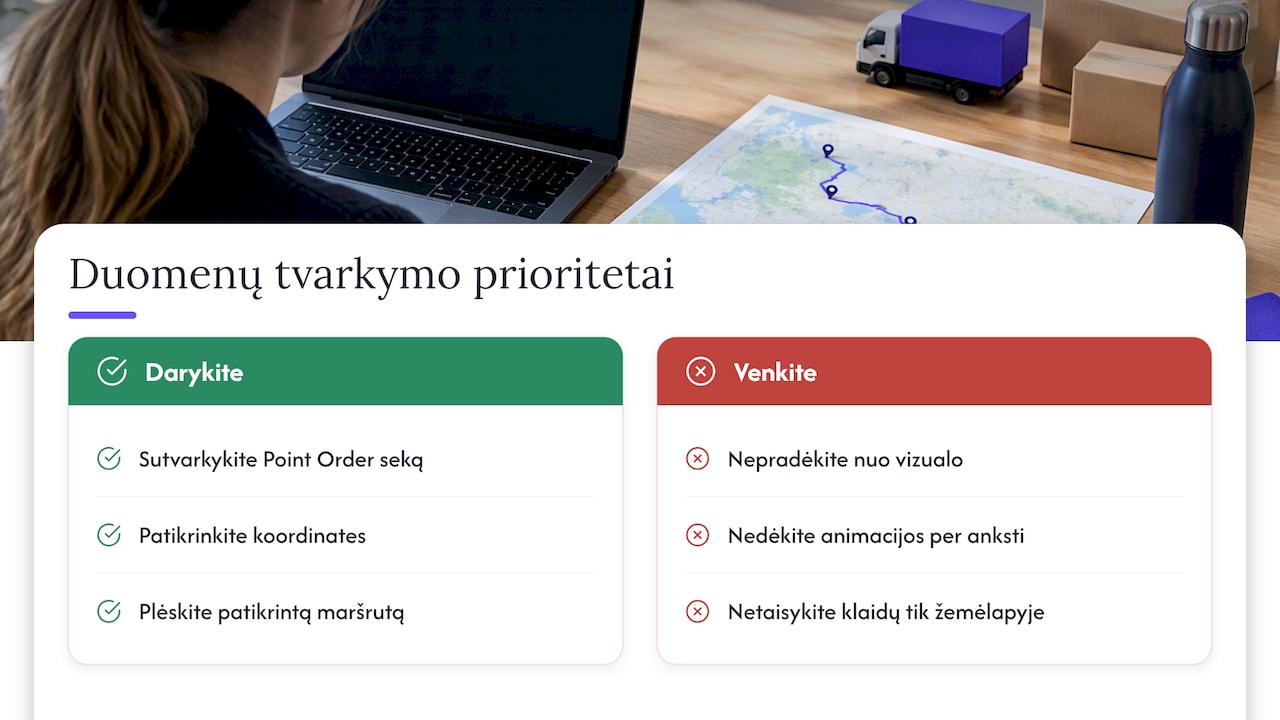
Most beginners go looking for the most attractive visual first, then get stuck on the data. In our view, the Path layer can work more smoothly with tidy data, while a messy sequence can produce an unexpected-looking line. So the first investment should not be colours or animation, but a clean Point Order sequence and correct coordinates.
The common advice to draw everything and fix the errors afterwards does not pay off: an incorrect line is harder to spot on a map than in a table. First get one route right from start to finish, make sure the sequence is correct, and only then expand to the whole fleet. Add animation only once you have checked the core solution, because it does not fix data problems.
— Analitika360
We can help you implement route analysis on your data

We offer ready-built Power BI report packages and bespoke projects tailored to your processes and existing systems. Get in touch for a quote; you will find prices and package contents on our pricing page.
Frequently asked questions
Which visual do I need to show routes in Power BI?
To show routes, use the Azure Maps visual with the Path layer switched on. It needs Path ID, Point Order and coordinate fields.
Is a time column required for animation?
Yes, animation needs a time field that Power BI recognises as a date and time. Without it, the map shows only a static route and movement over time cannot be recreated.
Why does my route line jump across the map?
The usual culprit is an incorrect Point Order or swapped coordinates. Sort the points by time, renumber them and check whether the coordinates are stored as integers.
How do I prepare origin–destination data?
In Power Query, unpivot both coordinate columns so that one row becomes two points. Build a unique Path ID from an index column, and assign an order to the start and end.